New Homepage and a CourtListener Revamp
 We're
happy to share today that we've completed a revamp of the CourtListener
website to make it more polished, easier to use and easier to learn.
There are a handful of changes we're really happy about and that we've
wanted to do for a long time.
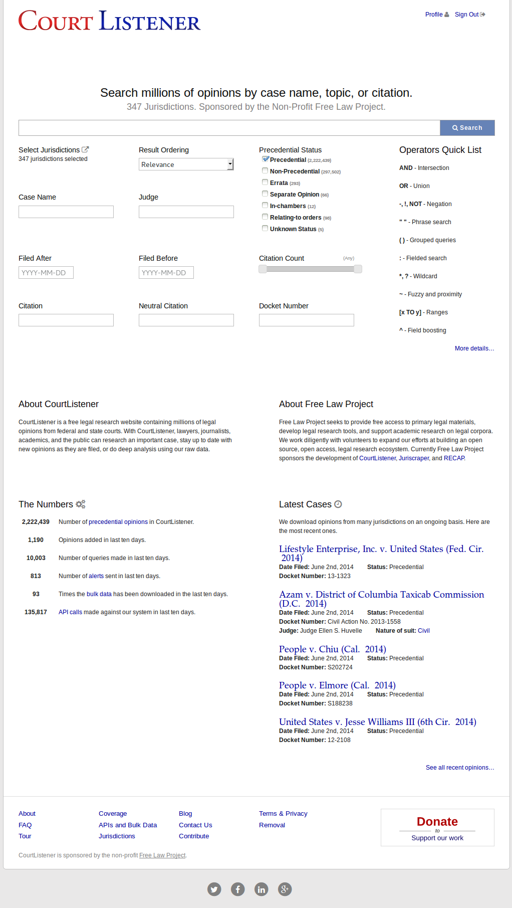
First, of course, is our new homepage. The new homepage is designed to showcase our latest material, to make new opinions easy to find, and to better introduce CourtListener to new users. The most striking change in the homepage is that at its center it now has a huge search box where you can place queries, and if you're an advanced user, you can press the "Advanced" button, and it will show you all of the search facets that we support, from Case Name to Citation Count.
The homepage also ushers in a change that's been in the works for some time -- we're finally ordering our results by "Relevance" instead of "Newest First". This change was made possible by the improvements we've made to our relevance engine over the past year, and is one we're really excited about. We expect that as you use the new homepage, you'll find the relevance engine to surprise and delight you.
The next major change that has come with the revamp is a new tour of the website that you can take to learn more about its features. In the footer there's a link to kick off the tour and we'll be experimenting with different ways to promote it to new users over the next couple of weeks. We are also working on a video that we expect will help people learn how to use the site.
The final change that we're rolling out (aside from our new FAQand About pages) are social links at the bottom of every page. We know people use different tools to stay up to date, so in addition to this blog, we also want to make sure that you can follow us on LinkedIn, Facebook, Twitter and Google+.